Sorry ladies and gentlemen, no villain origin stories here. Maybe a redemption arc?
Historical GIS has been one of the units that I’ve been looking forward to. I didn’t really know what I was getting into, though. I’ve always been interested in mapping, but I had no idea what GIS actually entailed, nor how it could be applied to history.
Needless to say, I was not disappointed. My existing interest in spatial history meshes well with HGIS, and so I was able to approach this technical exercise with a level of enthusiasm I couldn’t quite summon for previous exercises. And imagine my delight when I opened QGIS and found that it has a similar interface and approach to data organization as Adobe Photoshop, which I’m already familiar with! I got lucky this week. 10/10 technical exercise.
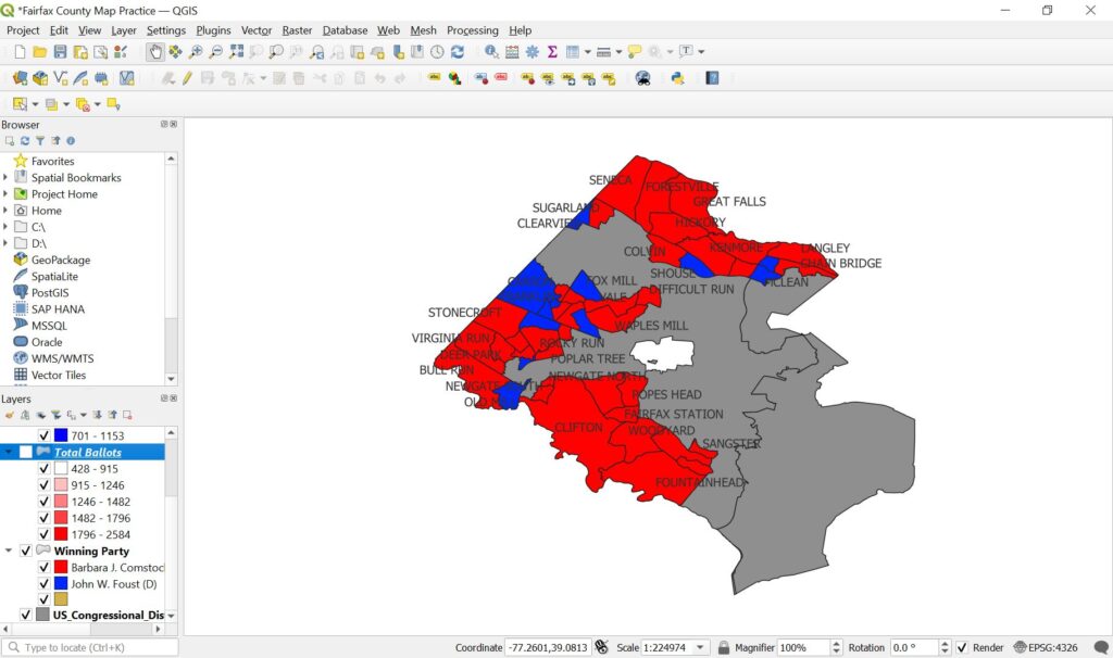
Below are some examples of the maps I was able to generate in QGIS utilizing the elections data. The first is a graduated map to show the total number of ballots across District 10. The second map is a breakdown of District 10 by party winner. I still need to experiment more with making legends and labels to increase readability.

Messing with and manipulating this data was really enjoyable, but it also made me realize how mapping can be misleading. At the end of the day, the person making the map is the last call on how data is going to be visualized, and the decisions made in creating that visualization can drastically affect perception. The mapmaker has the power to skew interpretation of data based on the presentation of it within the map, and that brings up a lot of ethical questions regarding the accurate portrayal of data.
Beyond this, GIS is far from objectivity. As we discussed in class, each map is made to make a statement—maps are literally built to further the agenda of the maker. One example we brought up as a class was that of the Native Land map (https://native-land.ca/). This map takes the North and South American continents, mainly, and portrays boundaries very differently to how we are used to seeing them. This makes a very specific statement on the state of territory and boundaries, especially in the United States, and shows very clearly how maps can have a voice of their own.
Though this post very much focuses on mapping data, HGIS involves much more. As the chapters “GIS and its role in historical research: an introduction” and “Using GIS to visualise historical data” show, GIS is much more than a simple mapping methodology. GIS is way of thinking that approaches data in a more spatial manner, and as such raises questions previously not accessed by more traditional historical methods. With GIS, historians are able to approach old concepts or old topics with new eyes and see (often literally) familiar information in a completely new light. Along these lines, GIS doesn’t have to only be applied to spatial topics. Rather, GIS should be applied to a variety of topics. This will increase the depth of knowledge on that topic and can lead to new interpretations.
While most of my GIS experience comes from fields outside history, it’s application in this field is extremely useful. Conveying data into into maps and other GIS project will further our understanding in spacial history and other developments in documenting change!